
Modifier order is not style, it is semantics
padding then clickable gives a different touch target from clickable then padding — and both look identical.
TL;DR
A Modifier chain is an ordered list, applied outside-in for layout and inside-out for
drawing. Swapping two entries can change the touch target, the clipped region, the ripple bounds,
or which element the accessibility tree exposes — while the pixels stay identical.
So Modifier.padding(16.dp).clickable { } gives a tap area that excludes the padding, and
Modifier.clickable { }.padding(16.dp) includes it. Both render the same button. Only one of them
is 48dp.
Order is behaviour. Read a chain as a sequence of wrappers, not a bag of properties.
The case this post is about
An icon button in a list row, written the way CSS habits suggest — appearance first, then behaviour:
@Composable
fun FavouriteButton(onToggle: () -> Unit, isFavourite: Boolean) {
    Icon(
        imageVector = if (isFavourite) Icons.Filled.Star else Icons.Outlined.StarBorder,
        contentDescription = "Favourite",
        modifier = Modifier
            .padding(12.dp)             // spacing
            .clickable { onToggle() }   // behaviour
    )
}
A 24dp icon with 12dp of padding — visually a comfortable 48dp target. It passed design review because it looks right.
The symptom
Four findings, and the first is the one users felt.
Taps near the edge of the button did nothing. The icon looked 48dp and responded as 24dp:
tap at the visual centre        → toggles
tap 16dp from centre (inside the visual bounds) → nothing
The ripple was the wrong size. A small circle confined to the icon rather than filling the touch area — which, in hindsight, was the visual tell that the clickable region was small.
An accessibility audit flagged the target size:
Touch target size 24dp × 24dp — below the 48dp × 48dp minimum
And a second, unrelated-looking bug in the same screen: a rounded card whose background bled outside its corners:
Modifier
    .background(Color.White)                // drawn first, unclipped
    .clip(RoundedCornerShape(12.dp))        // clips what comes AFTER it
Same root cause — order — in a chain nobody suspected.
Why the obvious fix failed
"Increase the padding." More padding, same problem: the clickable region is still only the icon. The visual target grows and the real one does not, which widens the gap between what users see and what responds.
"Add Modifier.size(48.dp)." This is where it gets subtle. size before clickable
genuinely does help — it makes the clickable area 48dp. size after clickable sizes the icon and
leaves the tap region at the outer measurement. Same modifier, opposite effect, depending on
position. I tried the wrong one first and concluded size did not work.
"Use IconButton." Correct, and it is the real answer for this widget — it bakes in the 48dp
minimum. It is also a workaround for not understanding the chain, and the next custom component
will have the same bug.
"Set minimumInteractiveComponentSize." Compose does enforce a minimum for some
material components, which is why this bug is less common than it used to be — and it does not
apply to a bare Icon with a clickable.
The actual mechanism
A Modifier is a linked list of wrappers, and .then() is concatenation. Each element wraps
the ones after it.
Layout is applied outside-in. The first modifier in the chain is the outermost. It receives the
incoming constraints, adjusts them, and passes them down. padding as the first element means:
take the available space, reserve 12dp on each side, and give the rest to everything after it.
Drawing is applied inside-out relative to that nesting — an outer modifier draws behind and clips what is nested inside it.
Input follows the layout nesting. clickable registers a pointer input region covering the
area it occupies — which is the area left after everything before it in the chain has taken its
share.
Which makes one particular ordering an accessibility defect rather than a cosmetic one:
Modifier.padding(12.dp).clickable { … }    // padding is DEAD — tap target is the content only
Modifier.clickable { … }.padding(12.dp)    // padding is tappable — target is content + 24dp
For a 20dp icon those two produce a 20dp and a 44dp touch target respectively, and the second is the number both platform guidelines ask for. The first still works — every tap on the glyph itself registers — so it passes a functional test, passes review, and fails for anyone whose aim is less precise than the person who wrote it. The ripple is the visible tell: it stops at the icon's edge rather than filling the padded area.
The same ordering question has the opposite answer one line up, which is why "put clickable
first" is not a rule worth memorising:
Modifier.clickable { … }.background(Blue)  // ripple draws UNDER the background — invisible
Modifier.background(Blue).clickable { … }  // ripple draws over it — visible
So the chain is not a bag of attributes with a style preference about order. Each position is a different composition of layout, drawing and input, and the question to ask at every link is which of those three am I affecting here — because the answer differs per modifier, and two adjacent lines can want opposite orderings for entirely consistent reasons.
So:
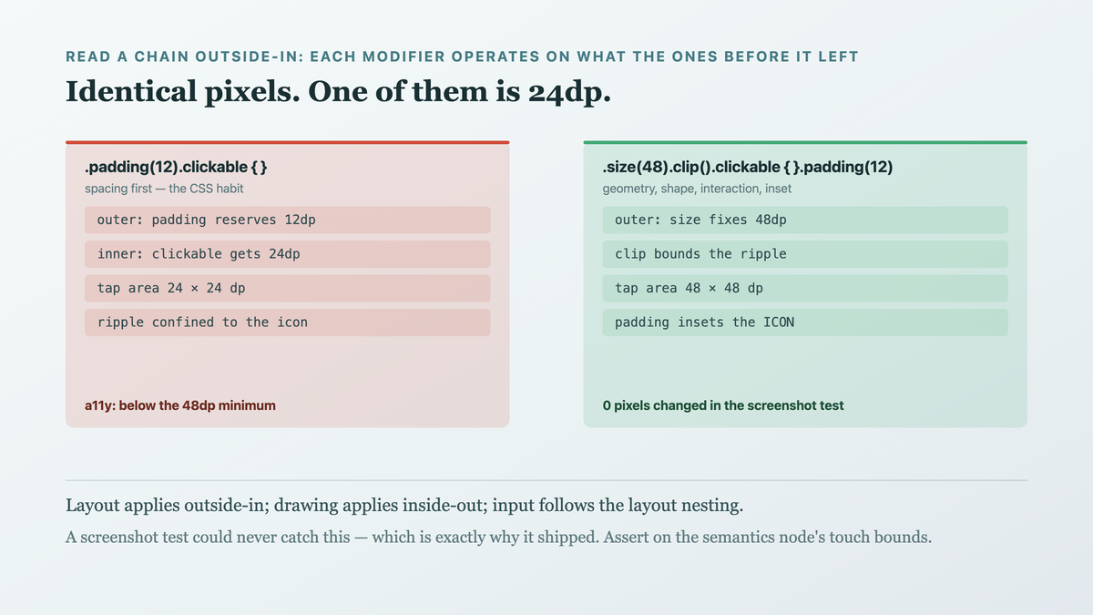
Modifier.padding(12.dp).clickable { }
// outer: padding reserves 12dp → inner: clickable gets 24dp. Tap area = 24dp.

Modifier.clickable { }.padding(12.dp)
// outer: clickable occupies 48dp → inner: padding insets the icon. Tap area = 48dp.
And the clip case is the same rule seen from the drawing side:
Modifier.background(White).clip(shape)   // background is OUTSIDE the clip → unclipped
Modifier.clip(shape).background(White)   // background is INSIDE the clip → clipped

Read a chain outside-in: each modifier operates on what the ones before it left. The rendered result can be identical while the interactive and accessible result is not — which is why this survives visual review.
The fix
Order by role: outer geometry, then interaction, then inner spacing and appearance.
@Composable
fun FavouriteButton(onToggle: () -> Unit, isFavourite: Boolean) {
    Icon(
        imageVector = if (isFavourite) Icons.Filled.Star else Icons.Outlined.StarBorder,
        contentDescription = if (isFavourite) "Remove favourite" else "Add favourite",
        modifier = Modifier
            .size(48.dp)                       // 1. the target's geometry
            .clip(CircleShape)                 // 2. clip BEFORE the ripple, so it is bounded
            .clickable(                         // 3. interaction, over the full 48dp
                onClick = onToggle,
                role = Role.Button,
            )
            .padding(12.dp)                    // 4. inset the icon WITHIN the target
    )
}
Four things that chain gets right:
size first makes the target 48dp regardless of the icon's intrinsic size. The geometry is a
decision, not a consequence.
clip before clickable bounds the ripple. The indication is drawn by clickable, so a clip
placed after it does not constrain it — another order-dependent behaviour with no visual tell until
you press.
padding last insets the icon inside the target rather than shrinking the target.
role = Role.Button is not about order and belongs in the same fix: the accessibility tree
should describe a button, and a bare clickable on an Icon does not.
And the card:
Modifier
    .clip(RoundedCornerShape(12.dp))    // clip is the outer wrapper
    .background(Color.White)            // drawn inside it → corners respected
A reading order worth internalising, which is what stops this recurring:
Modifier
    .fillMaxWidth() / .size()      geometry — what space do I occupy
    .clip() / .shadow()            shape — what region am I
    .background() / .border()      surface — what is painted on that region
    .clickable() / .pointerInput()  interaction — over that whole region
    .padding()                      inset — what is left for my content
Not a universal law — padding before background is correct when you want an outer margin — but
a default that produces the behaviour people usually intend.
How we proved it
That the tap area changed, measured rather than felt. A UI test asserting on the semantics node's bounds, which is the thing the accessibility checker reads:
@Test
fun favouriteButtonMeetsMinimumTouchTarget() {
    composeTestRule.setContent { FavouriteButton({}, isFavourite = false) }
    val bounds = composeTestRule
        .onNodeWithContentDescription("Add favourite")
        .fetchSemanticsNode()
        .touchBoundsInRoot
    with(composeTestRule.density) {
        assertTrue(bounds.width.toDp() >= 48.dp, "width ${bounds.width.toDp()}")
        assertTrue(bounds.height.toDp() >= 48.dp, "height ${bounds.height.toDp()}")
    }
}
before:  FAILED — width 24.0.dp
after:   PASSED
That a tap at the edge now registers — the user-visible claim:
@Test
fun tapNearTheEdgeToggles() {
    var toggled = false
    composeTestRule.setContent { FavouriteButton({ toggled = true }, false) }
    composeTestRule.onNodeWithContentDescription("Add favourite")
        .performTouchInput { click(Offset(4f, 4f)) }    // near the corner
    assertTrue(toggled)
}
before:  FAILED — no click registered
after:   PASSED
And that the pixels did not change, which is the point of the whole post:
$ ./gradlew compareRoborazziDebug
favourite-button-unselected.png   0 pixels changed
favourite-button-selected.png     0 pixels changed
Zero pixels changed while two behavioural tests flipped from red to green. A screenshot test could never have caught this, and that is exactly why the bug shipped.
One limit: touchBoundsInRoot reports the semantics node's touch bounds, which is the right
measure for the accessibility minimum and is not identical to the pointer-input region in every
case (a pointerInput with custom hit testing can differ). For clickable they coincide, and for
anything more exotic I would assert with a real gesture as in the second test.
What this generalizes to
An ordered chain is not a property bag. CSS habits teach that declarations are unordered within a rule; builder chains, middleware stacks, interceptor lists and decorator wrappers are all ordered, and the order is the composition. Reading one left-to-right as "outermost first" is the skill.
Identical output does not mean identical behaviour. Visual review, screenshot tests and design sign-off all passed on a 24dp button that looked 48dp. When two implementations render the same, the difference lives in interaction, accessibility, or performance — and you need a different instrument for each.
Assert on the accessibility tree, not only on pixels. The semantics node is where touch bounds, roles and labels live, and it is the layer both assistive technology and your tests can read. Checks there catch a class of bug screenshots structurally cannot.
Learn the rule, then keep the convention. IconButton fixes this one widget; understanding
outside-in fixes every future custom component. The ready-made component is still the right choice
— just not instead of knowing why.
Related
- Constraints flow down, sizes flow up, and fillMaxSize means something specific — the layout pass this chain feeds
- Recomposition is not re-rendering, and that is why your list stutters — reading what Compose actually does
- A LazyColumn without keys loses your scroll position and your animations — another invisible-until-it-is-not default
Keep reading
This is part of 100 Days of Compose — the mechanisms underneath the API, measured rather than guessed. Follow MobileByteSensei for the rest.
One post a week, no digest
New writing when it lands. No roundups, no course pitch, no "10 tips".