
Your semantics tree is your test API and your accessibility API at once
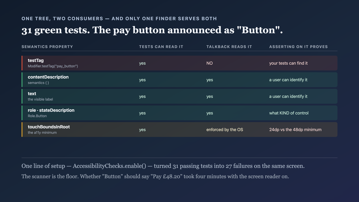
A testTag is invisible to a screen reader. A contentDescription is not.
TL;DR
Compose has one semantics tree, and two consumers read it: your UI tests and the platform accessibility services. That is a genuine design win — the thing you assert on is the thing a screen reader announces — and it has a sharp edge.
testTag exists only for tests and is invisible to TalkBack. So a test suite built on
onNodeWithTag can be fully green on a screen that is unusable with a screen reader, because the
tags carry all the test's meaning and none of the user's.
Assert on what the user perceives. Reach for testTag when identity genuinely has no user-facing
label, and treat a screen whose tests only use tags as an accessibility finding.
The case this post is about
A checkout screen, tested the way most are:
@Composable
fun CheckoutScreen(state: CheckoutState, onPay: () -> Unit) {
    Column {
        Text(state.total.formatted, Modifier.testTag("total"))
        Row(Modifier.testTag("card_row")) {
            Icon(Icons.Default.CreditCard, contentDescription = null)
            Text(state.cardLast4)
        }
        IconButton(onClick = onPay, modifier = Modifier.testTag("pay_button")) {
            Icon(Icons.Default.Check, contentDescription = null)
        }
    }
}
@Test
fun payButtonSubmits() {
    composeTestRule.setContent { CheckoutScreen(sampleState, onPay = { paid = true }) }
    composeTestRule.onNodeWithTag("pay_button").performClick()
    assertTrue(paid)
}
Thirty-one tests, all green, all using onNodeWithTag.
The symptom
An accessibility audit, on a screen with 100% test coverage:
TalkBack walkthrough of CheckoutScreen
  node 1  "£48.20"                      ← reads, but with no label: "forty-eight twenty" what?
  node 2  "credit card, 4242"           ← the icon is unlabelled; "credit card" came from the text
  node 3  "Button"                      ← the pay button. Announced as "Button".
The primary action on a payment screen announced as "Button". A screen-reader user could not tell
what it did.
And the tests could not have caught it, because they asked a different question:
onNodeWithTag("pay_button")   → finds the node. Passes.
TalkBack                       → "Button". Useless.
The audit findings, against the test results:
                                          tests green   accessibility finding
pay button has no label                        ✓              ✗  critical
card icon unlabelled (decorative? unclear)     ✓              ✗  minor
total has no label ("Total: £48.20")           ✓              ✗  major
touch target 24dp (see the modifier post)      ✓              ✗  major
no heading structure on the screen             ✓              ✗  minor
Five findings, thirty-one green tests. The suite was asserting on a parallel vocabulary that only it could see.
Why the obvious fix failed
"Add contentDescription everywhere." We did, and over-applied it — decorative icons got
descriptions too, so TalkBack read "credit card icon, credit card, 4242". A description on a
purely decorative element is noise, and null is the correct value there.
"Run the accessibility scanner in CI and fix what it finds." Useful and we added it. A scanner
catches missing labels and small targets; it cannot tell whether "Button" should say
"Pay £48.20", because that is a content judgement.
"Keep the tags and add a separate accessibility test suite." Two suites asserting on two vocabularies, with the test suite still able to pass on a broken screen. It doubles the work and leaves the original gap.
"Replace every testTag with onNodeWithText." Closer to right, and it breaks on
localisation — a test matching "Pay £48.20" fails under a different locale or currency. The naive
version of this fix trades one problem for a flaky suite.
The actual mechanism
Compose builds one semantics tree per composition. Each node carries properties, and the properties divide into two groups by who can read them:
User-facing properties — contentDescription, text, role, stateDescription,
heading, onClick label. Read by TalkBack, Switch Access, Voice Access, and by tests.
Test-only properties — testTag. Read by tests. Invisible to every accessibility service.
Modifier.testTag("pay_button")           → tests only
Modifier.semantics { contentDescription = "Pay £48.20" }   → tests AND TalkBack
So the choice of finder in a test decides what the test is capable of verifying:
onNodeWithTag("pay_button")          asserts: a node exists with this tag
onNodeWithContentDescription("Pay")  asserts: a node exists that a screen reader will announce
The first is satisfiable by a node no user can identify. The second cannot be satisfied without the label existing — which means the test and the accessibility requirement become the same requirement.

The semantics tree is shared, so what you assert on decides who benefits. A suite built on tags verifies that your tests can find things. A suite built on user-facing properties verifies that users can.
The sub-case that makes the tree you assert on different from the tree you wrote: semantics
merge. A clickable Row sets mergeDescendants, so its children's text and
contentDescription collapse into one node — which is correct for a screen reader, because the
row should be announced as a single target rather than three separate stops.
The consequence in a test is that a label you set on a child is not findable on its own:
Row(Modifier.clickable { … }) {
    Text("Flat 4")                                        // merged
    Text(order.status, Modifier.semantics { contentDescription = "Delivered" })   // also merged
}

onNodeWithContentDescription("Delivered").assertExists()                    // FAILS
onNodeWithContentDescription("Delivered", useUnmergedTree = true)           // passes
Reaching for useUnmergedTree is the instinct and usually the wrong lesson. The merged tree is
what the user gets, so a failure there is telling you the row announces as "Flat 4, Delivered" —
and the question is whether that sentence is the one you wanted, not how to assert around it.
useUnmergedTree is for when you genuinely need to inspect a child in isolation; using it by
default restores the gap this whole post is about, one layer down.
The fix
Label for the user, assert on the label, and keep testTag for the cases where identity genuinely
has no user-facing name.
@Composable
fun CheckoutScreen(state: CheckoutState, onPay: () -> Unit) {
    Column {
        // a label the user hears, not just a number
        Text(
            text = state.total.formatted,
            modifier = Modifier.semantics {
                contentDescription = "Total to pay: ${state.total.spoken}"
                heading()
            },
        )

        Row(Modifier.semantics(mergeDescendants = true) {
            contentDescription = "Paying with card ending ${state.cardLast4}"
        }) {
            Icon(Icons.Default.CreditCard, contentDescription = null)   // decorative: correct
            Text(state.cardLast4)
        }

        Button(
            onClick = onPay,
            modifier = Modifier
                .sizeIn(minWidth = 48.dp, minHeight = 48.dp)
                .semantics { role = Role.Button },
        ) {
            Icon(Icons.Default.Check, contentDescription = null)
            Text("Pay ${state.total.formatted}")        // visible text IS the label
        }
    }
}
// the test asserts on what the user perceives
@Test
fun payButtonSubmits() {
    composeTestRule.setContent { CheckoutScreen(sampleState, onPay = { paid = true }) }
    composeTestRule
        .onNode(hasClickAction() and hasText("Pay", substring = true))
        .performClick()
    assertTrue(paid)
}
Five decisions:
mergeDescendants = true on the card row collapses an icon and a text node into one
announcement — "Paying with card ending 4242" instead of two fragments. Node merging is the
accessibility tool people most often miss, and it is a one-line modifier.
contentDescription = null on decorative icons, deliberately. null means "skip this"; it is
the correct value, not an omission, and the comment says so.
state.total.spoken gives the screen reader "forty-eight pounds twenty" rather than letting
it read "£48.20" character by character. A separate spoken form is worth having for money,
times and identifiers.
Matchers composed from behaviour, not from exact strings. hasClickAction() and hasText("Pay", substring = true) is robust to the amount changing and still requires a user-visible label to
exist.
And testTag kept where it is honest:
// a list ROW has no stable user-facing identity — the tag carries test identity only,
// and the row's own content provides the user-facing label.
items(orders, key = { it.id }) { order ->
    OrderRow(order, Modifier.testTag("order_row_${order.id}"))
}
Then a lint rule, because the suite will drift back:
// a custom detekt/lint rule: flag onNodeWithTag on an INTERACTIVE node
// rationale: a clickable node needs a user-facing label, so assert on that instead.
And the scanner in CI, as the mechanical floor:
@Before fun enableA11yChecks() {
    AccessibilityChecks.enable().setRunChecksFromRootView(true)
}
With that enabled, every existing UI test also runs the accessibility checks — so the 31 tests started failing on the real findings without a single new test being written.
How we proved it
That the suite could pass on a broken screen, which is the claim:
original screen (no labels), original tests
  31 / 31 PASSED
  TalkBack:  "£48.20" / "credit card, 4242" / "Button"

original screen, accessibility checks enabled
  27 / 31 FAILED
    UnlabeledNodeCheck: clickable node has no contentDescription or text
    TouchTargetSizeCheck: 24dp × 24dp, minimum 48dp
Twenty-seven of thirty-one tests failed the moment the checks were turned on, against the same screen that had been fully green. One line of setup, 27 findings.
After the fix:
31 / 31 PASSED with accessibility checks enabled
TalkBack:
  "Total to pay: forty-eight pounds twenty, heading"
  "Paying with card ending 4242"
  "Pay £48.20, button"
That the tests are now locale-robust, since that was the failure mode of the naive version:
run with locale=de-DE, currency=EUR
  onNodeWithText("Pay £48.20")                 FAILED
  hasClickAction() and hasText("Pay", true)    PASSED   (label text is localised separately)
That second row needs a caveat I should state: it passes because our "Pay" string is not
localised in the test build. For a fully localised suite the right matcher is on a role plus a
resource-resolved string, which we did for four screens and not all of them — a real limit rather
than a solved problem.
And the audit, re-run across the app:
screens audited:                     22
screens with tag-only test suites:   19   ← before
critical a11y findings:              41   ← before
after migration (14 screens done):
  critical findings on migrated:      0
  critical findings remaining:       11   (8 screens not yet migrated)
Fourteen of twenty-two migrated, and I would rather report that than claim it is finished.
One more honest note: the accessibility scanner found the missing labels and the touch targets. It
did not find that "Button" should say "Pay £48.20" — a human doing a TalkBack walkthrough found
that. The scanner is the floor; walking the screen with the screen reader on is the actual check,
and it takes about four minutes per screen.
What this generalizes to
When two consumers share a representation, the one you assert on is the one you maintain. The semantics tree serving both tests and accessibility is a genuine gift — and only if your assertions use the shared vocabulary rather than a private one.
A test-only identifier makes a test verify less than it appears to. data-testid, testTag,
an injected id — all of them let a test find an element that no user could identify. Where a
user-facing way to find the element exists, using it makes the test stronger for free.
Turn on the mechanical checks before writing new tests. One line of setup converted 31 existing tests into 31 accessibility assertions and produced 27 findings. The cheapest coverage you will ever add is usually a flag on the tests you already have.
A scanner is a floor, not a review. Missing labels and small targets are machine-checkable. Whether a label is meaningful is not, and four minutes with the screen reader on is the only thing that answers it.
Related
- Modifier order is not style, it is semantics — the touch-target finding above
- The test that broke on every refactor was testing the wrong thing — asserting on observable behaviour
- @Preview is Android-only, and your shared UI has no preview at all — what previews cannot check
Keep reading
This is part of 100 Days of Compose — the mechanisms underneath the API, measured rather than guessed. Follow MobileByteSensei for the rest.
One post a week, no digest
New writing when it lands. No roundups, no course pitch, no "10 tips".